Our Story
At AEPACS, we offer reliable, high-quality manpower solutions tailored to Singapore's businesses. With years of personal and corporate experience, we are known for our professionalism, efficiency, and friendly service, helping clients find the right manpower solutions to support companies’ growth.
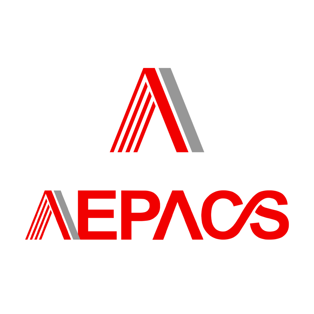
The red in the logo symbolizes energy, passion, power, and excitement, while grey represents neutrality, balance, practicality, stability, and strength.
The six stripes represent the six core pillars of AEPACS’ beliefs.
The structure of the capital “A”—with its strong, grounded base and peak pointing upward—the capital “A” design reflects a strong foundation and upward growth, symbolizing AEPACS’s role in supporting clients and workers toward mutual success.

The connected “C” and “S” (Customer Service) embody the company’s belief in strong, meaningful connections—among clients, candidates, and the team. Through proactive communication and tailored services, AEPACS aims to build long-term, trust-based relationships.
At its core, AEPACS is driven by a client-centred approach, believing that strong service unlocks endless potential in outcomes, strategies, and partnerships.


